Backstory
Williams' e-commerce conversion rate has been steadily declining, and the site hasn't been updated since 2019. This has led to a surge in customer support calls, with users struggling to place or manage orders, leading to frustration and a poor shopping experience.


Kickoff & Goal alignment
During the kickoff meeting, I discovered Williams is 2019-built e-commerce site was outdated with bad user experience that lead to conversion rate drop, unnecessary customer support calls and tickets.
The business needed a scalable solution for Munro’s other sites, making this redesign a crucial step forward. We aligned our goals for the MVP on our first realise.
Aligned Goals
1. End-to-end redesign of Williams' e-commerce site for a better user experience.
2. Optimise key touchpoints to boost conversion rates.
3. Reduce customer support calls and ticket volume.
4. Create a scalable solution for Munro’s other sites.
Defining Success metrics
Once we aligned our project goals, we worked with stakeholders to define success metrics. While revenue and conversion rate were key, we also considered long-term internal and external metrics for sustained growth such as: User survey NPS, Feedback from customer support etc.
Technical limitation on A/B Testing plan
Rather than flip the whole site all in one go which is a very risky move, we proposed incremental improvements via Multivariate Testing, but after discussed with the devs, turns out multivariate testing will require huge development effort as they need to manually build the all the variant via Magento due to different code environment.

Due to the technical constraint and tidy timeframe for golive, we have to do A/B Testing page by page which contains multiple design changes. But the positive thing is that we will be able to do multivariate testing once we are in full Next JS.

User Research
Once we kicked off the project, I began exploring how to approach it. Since Williams already had an existing e-commerce site, I think might be a good idea to start by researching our current users.
User Surveys
Curious about our users' thoughts on our e-commerce experience, I set up a Hotjar survey on our site.
To allow users time to interact, the survey pops up after 120 seconds (from the homepage to the product page or product page to checkout).
Early responses indicated key areas needing attention: Filters, Cart & Checkout, Account, and Find in Store.

Observation
Observing how customers interact with our e-commerce site provided valuable insights. I reviewed Hotjar recordings of both desktop and mobile sessions, focusing on Cart & Checkout, Filters, and My Account—areas that received the most negative survey feedback.
From the recording, I've discovered some initial insight such as:
1. User seems tap the wrong filter selection often.
2.User have to scroll all the way up each time to use filter.
3. User going back and forward between cart&checkout.
4. User seems spent sometime to locate their purchased items

Current GA data review
To uncover more insights, I reached out to our DA and dug into 6 months of Looker Studio data. I've discovered more interesting insights:
1. Over 70% of users are on mobile.
2. With nearly 90% sorting product listings from lowest to highest price.
3. Interestingly, the "Find in Store" and "Store Selector" buttons received more clicks than "Add to Cart," showing a preference for in-store pickups, though these features led to frustration, as reflected in poor survey responses.
4. Users mostly check orders and rewards., and most land directly on the product listing page, skipping the homepage altogether.

Customer Interview
For more in-depth insights, I've also collaborated with the marketing department to recruit existing customers for interviews, balancing valuable insights with budget constraints.
We sent screening questions via Google Forms through our brand's EDM, and once responses were collected, we manually screened the candidates.

During the interviews, we asked users about their shopping habits, decision-making process, and frustrations—both general and specific to our site. We also explored why they remained returning customers despite these issues. The responses aligned with our previous research but revealed some interesting findings:
1. Users can't edit product details once in checkout, and the shopping bag detail disappears.
2. They adjust filters when faced with ugly shoe options in the results.
3. Users struggle to track their shipments and often need to call for updates.
4. They want to see more products per screen with less scrolling.
5. Missing or forgot to put in their promo code, have to call customer care to cancel.
User Persona
Based on the customer segments provided by the marketing department and our previous research, we created our user persona - Laura.
Laura is a 42-year-old full-time nurse with an average income, living in Narre Warren. She’s married with children and has a busy lifestyle balancing work and family. She typically does some in-store shopping near her workplace after her shifts.

Current Purchasing Flow
Combining the previous findings, I began consolidating the insights and mapping out the current purchasing flow, then analysed it with the stakeholders.

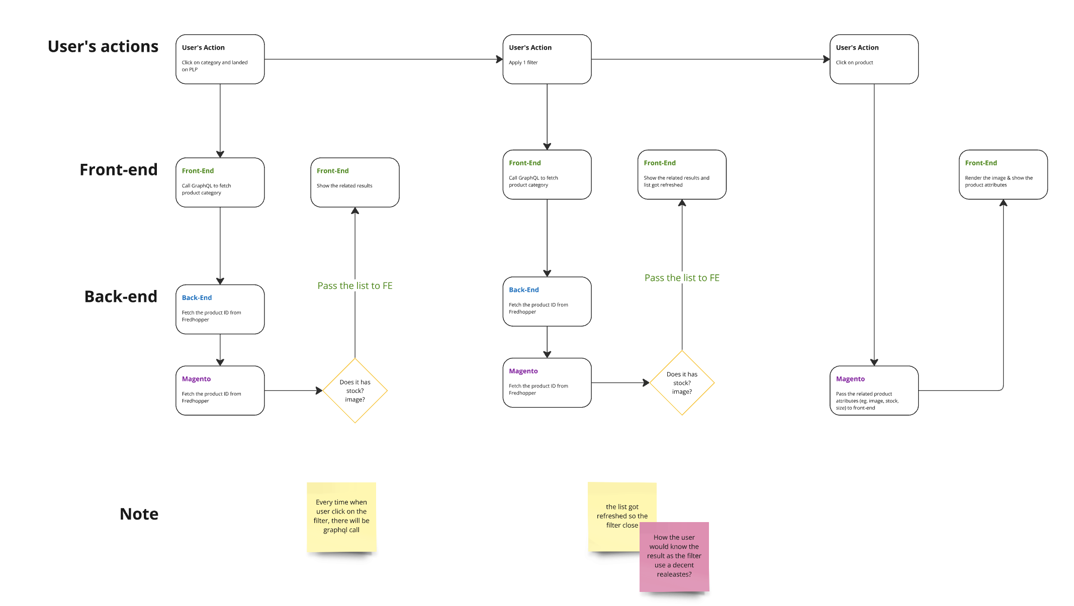
Service Blueprint & User Flow - Filter
We further examined how the current filter works both on the front-end and back-end. I organised a small workshop with the devs to map out our existing flows.

Problems Definding
As a busy nurse, Laura's limited browsing time on mobile makes the current flow frustrating. Revising filters requires multiple clicks, and duplicated information from product page to checkout adds unnecessary effort. Out-of-stock products, especially when a nearby store has them, and having to call the store, only increase her frustration.
1. Difficult to manoeuvre filter selections.
2. No alternative action when no product results.
3. Unnecessary steps between product page and checkout.
4. Users often miss adding promo codes.
5. When stock is available in-store, users must visit the store for offline purchase (uncertain if it’s still available upon arrival).
6. Lack of order details.
7. Hard to track shipments.
8. No loyalty information visible.
Problems to Insights
1. How might we provide a better way for users to revise their filter selection while browsing products?
2. How might we provide an alternative action when there is no filter/search result?
3. How might we reduce the user's buying process?
4. How might we guarantee users the item is still available when they arrive?
5. How might we provide better information for post-purchase users?